bayshore dental - bayshore, wisconsin
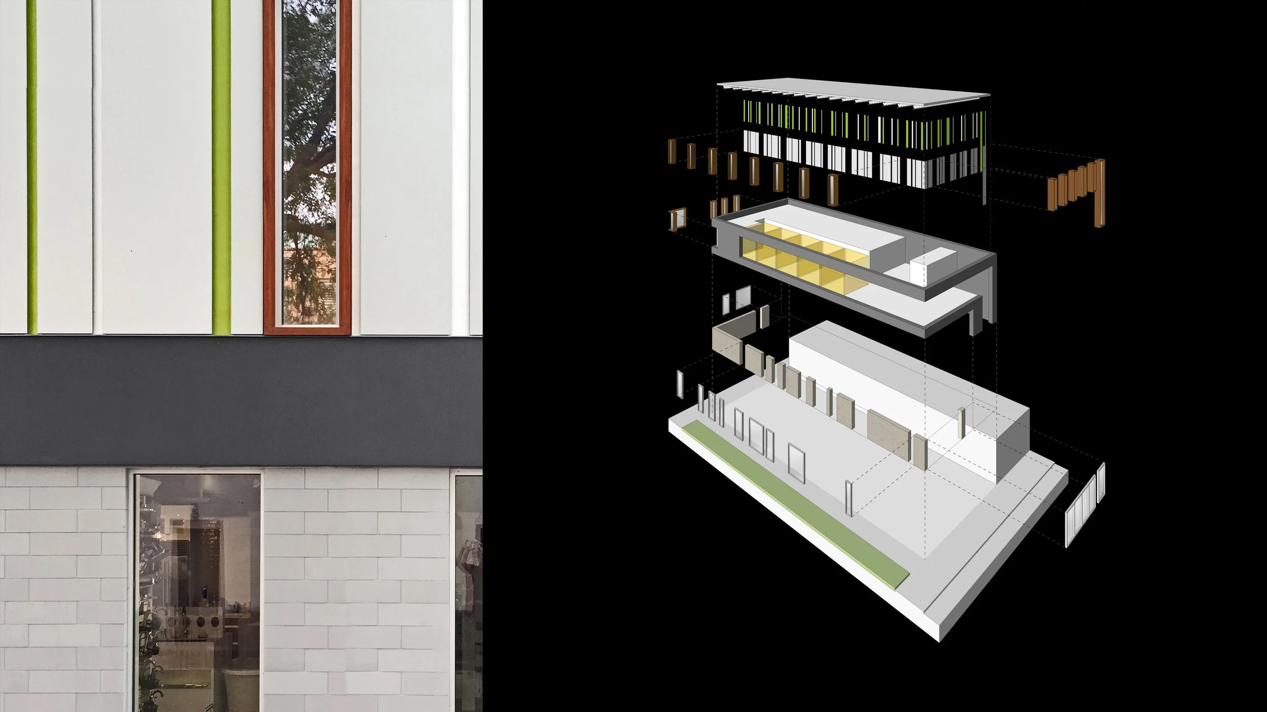
Located along a mature but struggling retail corridor in a first-ring Milwaukee suburb, Bayshore Dental is the ambitious reinvention of an abandoned commercial building at the end of its useable life and the transformation of the upper level into a state-of-the-art dental clinic. Originally an ordinary infill building with glazing only along the street, the demolition of an adjacent structure in 1986 and the subsequent creation of a small pocket park turned the building’s suddenly exposed firewall into a prominent but entirely blank façade whose foreboding, inhospitable presence contributed to the property’s ultimate demise as viable commercial real estate.
In 2015, a young dentist with a growing reputation for innovative dentistry acquired the dilapidated building with the intention to rehabilitate it as a vibrant business anchor and locate her fledgling practice there. The project’s success depended on an architecture for the building as a whole, and the clinic in particular, that could convey the very ethos and high standards of her own professional work: uncompromising purity, flawless efficiency, and rigorous precision.
After gutting the existing building, large openings were cut into the existing firewall to animate the building’s appearance along the pocket park and increase visibility of the ground floor retail space. On the upper level, a series of new floor-to-ceiling windows draw natural light deep inside the dental clinic, their articulated, wooden box frames adding a warm element to the monochromatic, formally exacting exterior palette.
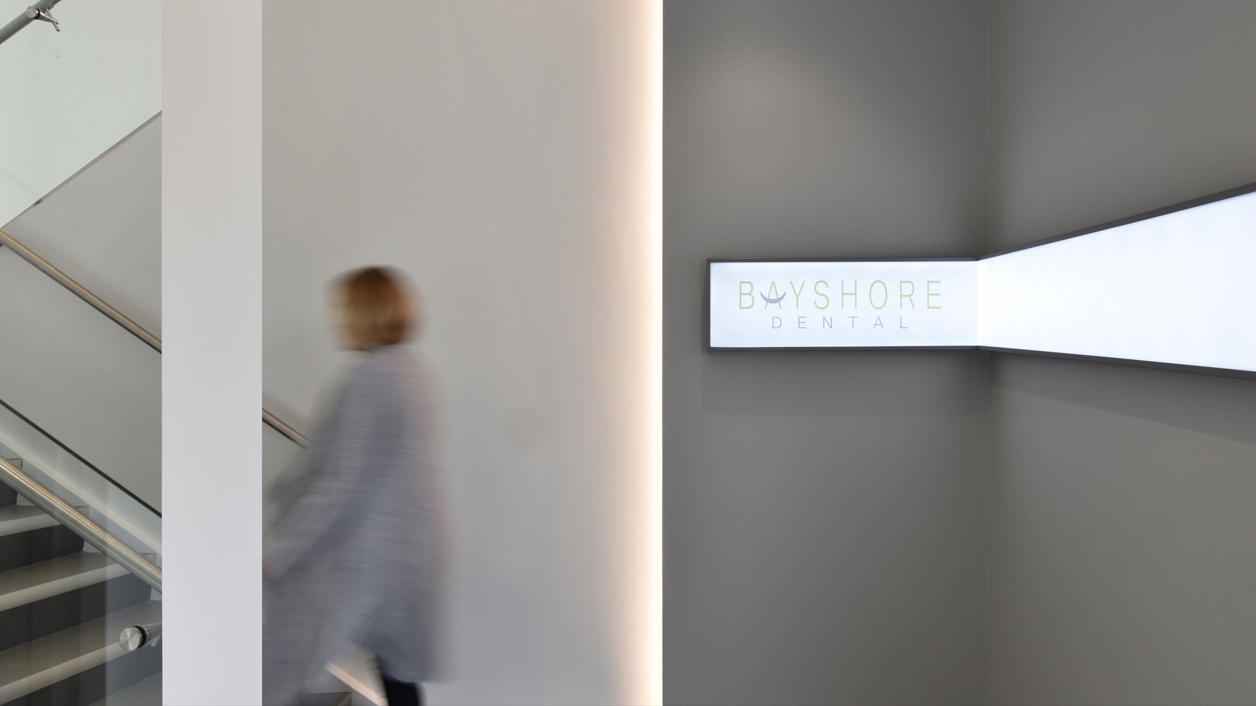
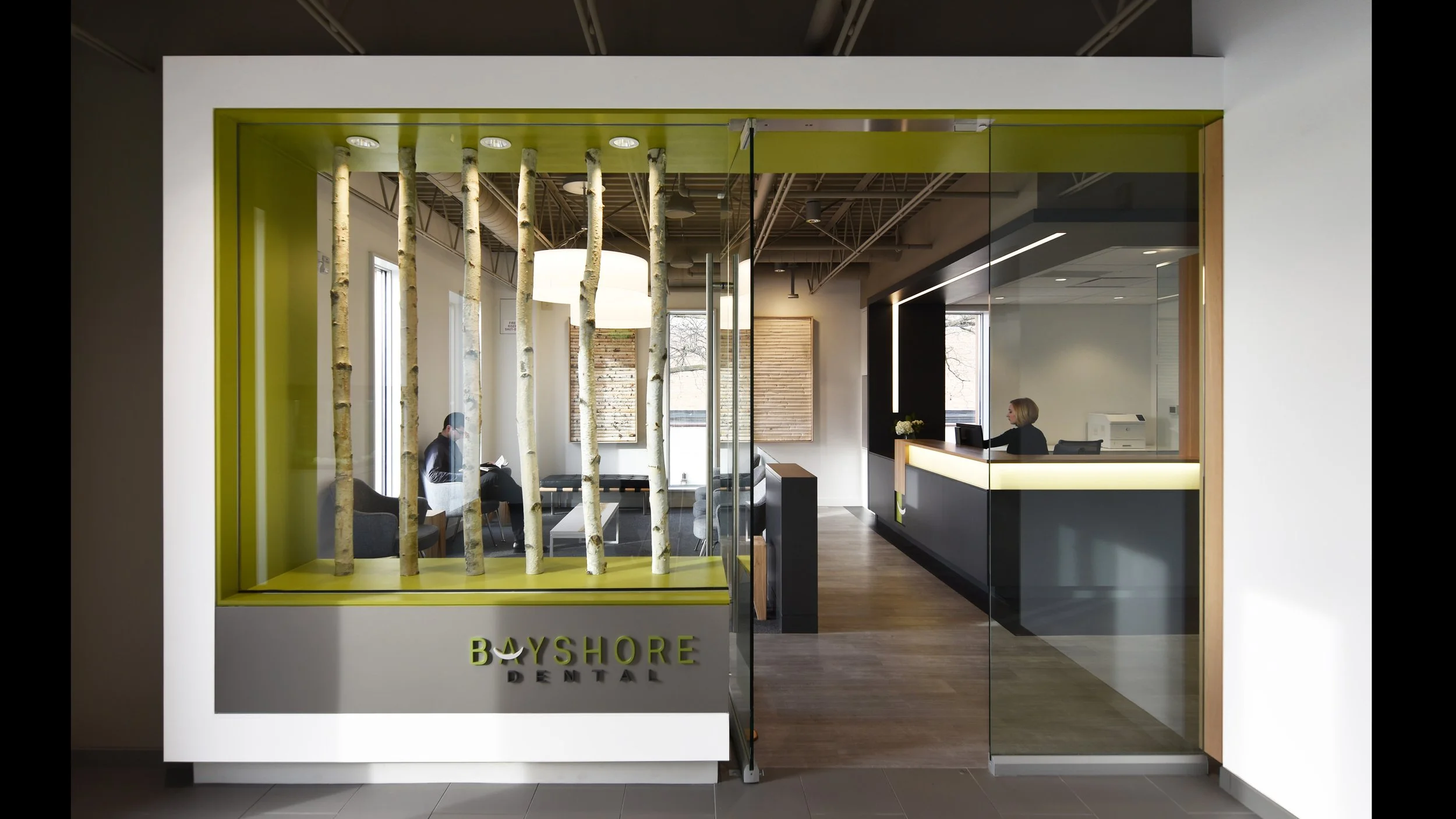
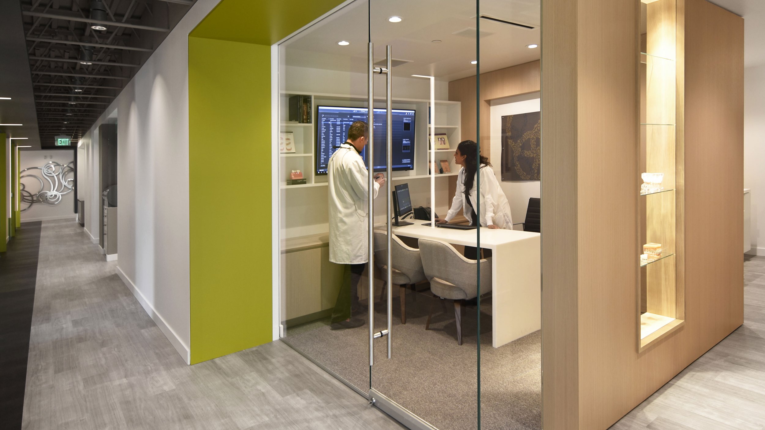
The new two-story building lobby takes patients up to the glazed entrance of the dental clinic, a carefully framed threshold that leads into the light-filled waiting room and features the tones and colors dominating the interior – shades of white and grey with occasional accents of green, all calibrated to tie into the clinic’s overarching graphic identity. The green-lacquered top of the entry cabinet, a low-slung toy chest with a retractable surface for kids’ activities, peels away from the base and turns into a linear, suspended soffit that connects the reception area with the wood-paneled consultation room located in the center of the clinic.
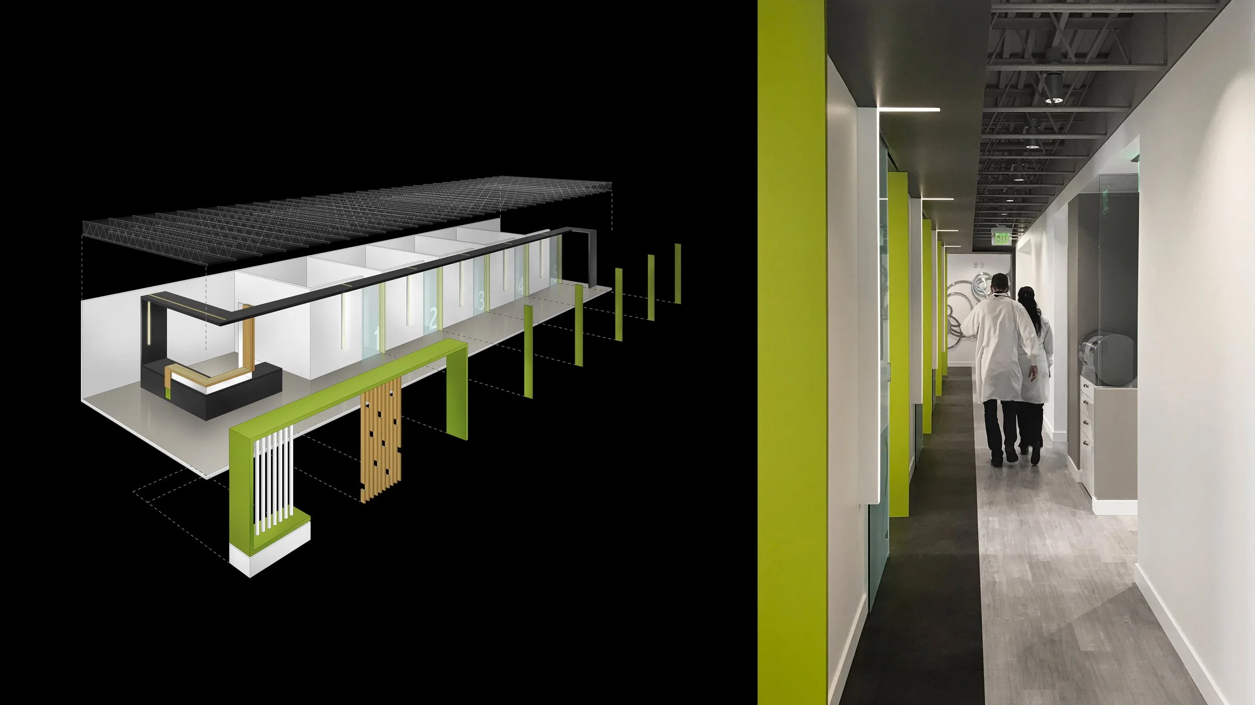
Optimized procedural flow strategies informed the layout of patient rooms, laboratories, staff offices, and sanitary infrastructure. The reception desk greets incoming patients and complements the formal vocabulary of clean lines and folding surfaces first introduced at the entrance. The reception’s monolithic, dark-grey volume transforms into a thin, continuous ceiling plane that functions as the dental office’s organizational back bone and establishes the central circulation spine, essentially bifurcating the clinic into a zone of operatories on one side and back-of-house spaces on the other.
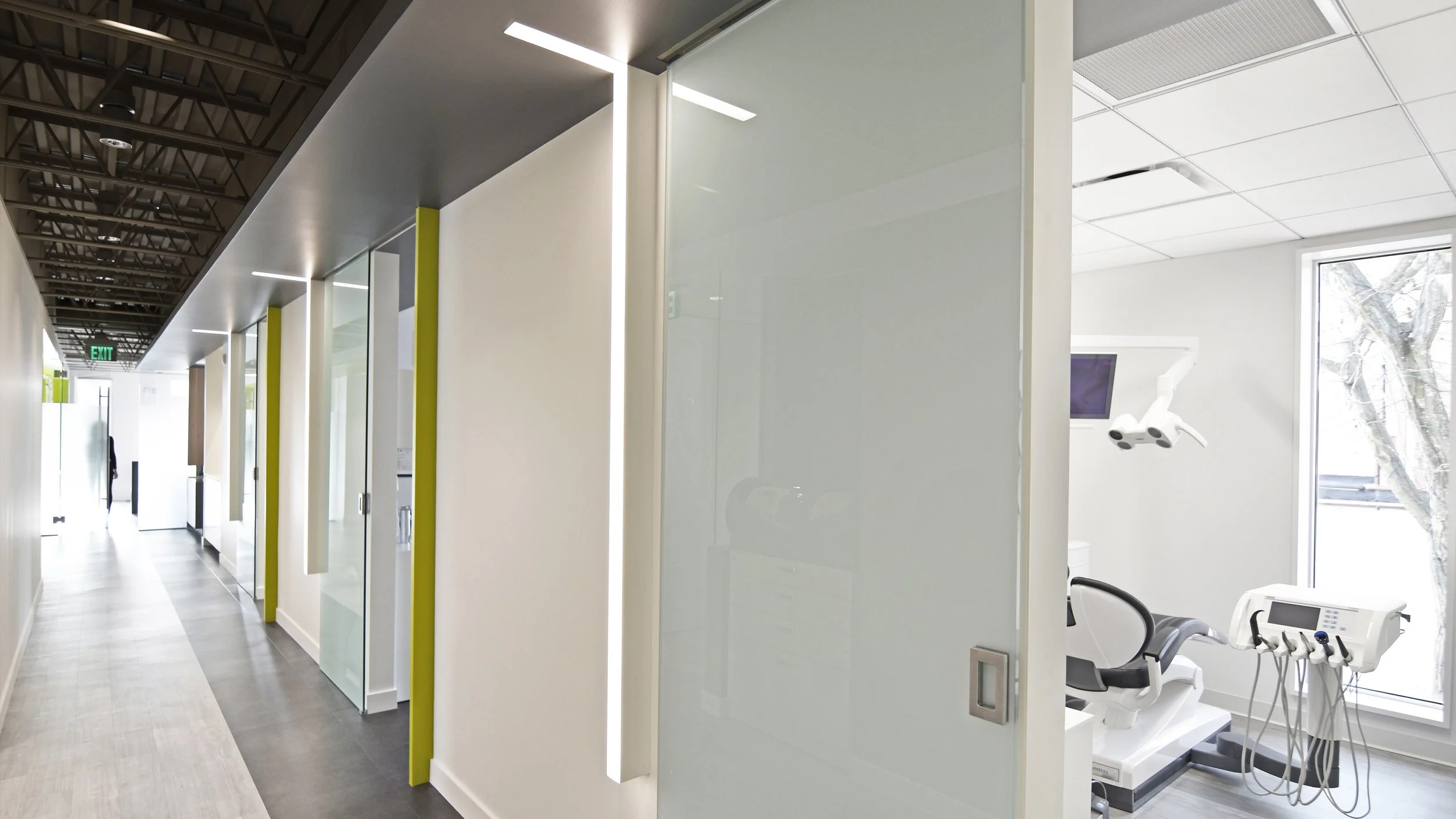
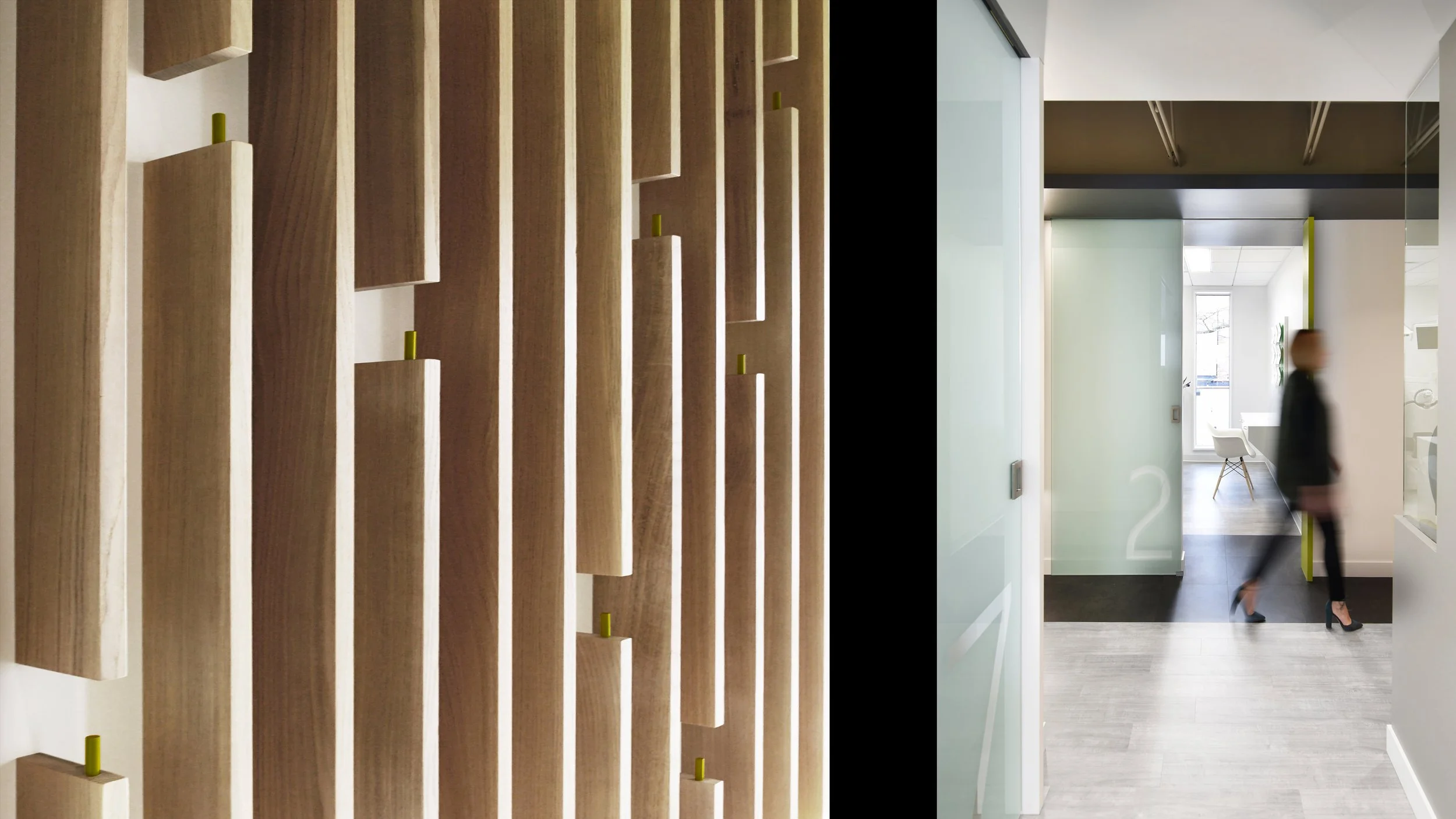
The ceiling plane, skim-coated to achieve a smooth, high-sheen surface that contrasts the industrial appearance of the exposed roof trusses above, guides patients from the waiting room to the seven individual operatories, their entries marked by green vertical panels and a corresponding sequence of thin lighting strips. Together, they set up a rhythm of protruding, vertical lines that visually animate the hallway space. Sliding glass panels assure separation and HIPAA-required privacy during procedures without significantly reducing the amount of natural light that can filter through the operatories into the central corridor and beyond.
The restrooms for patients and staff feature white-oak cabinets and green-lacquered surfaces that add a visual richness rarely found in health care environments. In the operatories, the dental furniture matches the whites and grays of the interior surfaces, as do the custom built-in cabinets throughout the clinic, reverberating the crisp, clean lines of wall and ceiling planes, and contributing to a deliberately quiet, serene ambience intended to appease a sometimes apprehensive clientele.


